Do you want to preview the mobile version of your WordPress site? Previewing the mobile layout helps you see how your website looks on mobile devices.
While you can certainly take a look at your live site on your phone, this doesn’t help during the development stage.
Even when your site is live, it’s often easier to view the mobile version on a desktop computer, so you can quickly make changes and see their effect.
In this article, we’ll show you two simple ways to easily preview the mobile layout of your WordPress site without switching to different devices.

Why You Should Preview Your Mobile Layout
More than 50% of your website visitors will be using their mobile phones to access your site. Around 3% will be using a tablet.
This means that having a site that looks great on mobile is essential.
In fact, mobile is so important that Google is now using a “mobile-first” index for their website ranking algorithm.
Even if you’re using a responsive WordPress theme, you still need to check how your site looks on mobile. You might even want to create different versions of key landing pages that are optimized for mobile users’ needs (more on this later).
In this article, we’re going to cover two different methods of testing how your site looks on mobile using desktop browsers.
It’s important to keep in mind that most mobile previews will not be completely perfect because there are so many different mobile screen sizes and browsers. Your final test should always be to look at your site on an actual mobile device.
1. Using WordPress’s Theme Customizer
You can use the WordPress theme customizer to preview the mobile version of your WordPress site.
Simply login to your WordPress dashboard and go to Appearance » Customize screen.
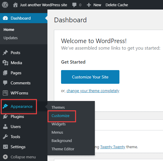
This will open up the WordPress theme customizer. Depending on what theme you’re using, you may see slightly different options in the left hand menu here:
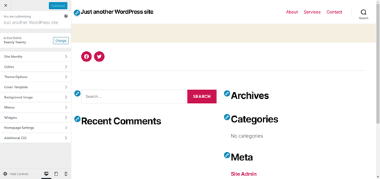
At the bottom of the screen, click the mobile icon. You’ll then see a preview of how your site looks on mobile devices.
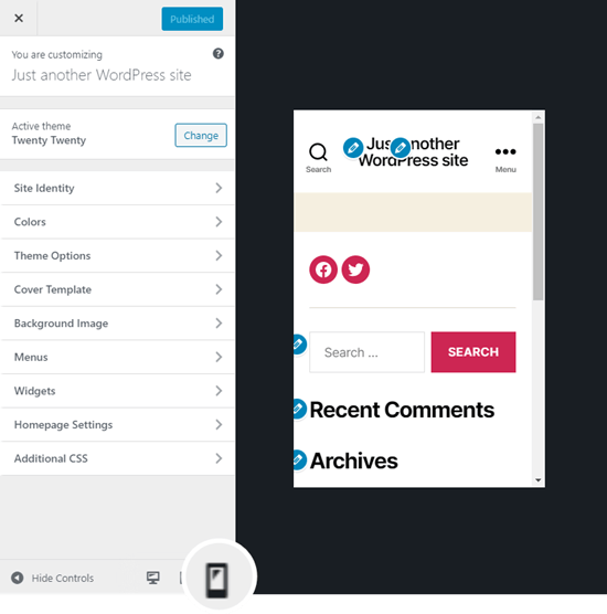
Note: The blue editing symbols are only present in the previewer. You won’t see these on your live site.
This method of previewing the mobile version is particularly useful when you’ve not yet finished creating your blog, or when it’s under maintenance mode.
You can make changes and check how they look before you put them live.
2. Using Google Chrome’s DevTools Device Mode
Google Chrome browser has a set of developer tools that let you run various checks on any website, including seeing a preview of how your website looks on mobile devices.
Simply open the Google Chrome browser on your desktop and visit the page you want to check.
This could be the preview of a page on your site, or it could even be your competitors website.
Next, you need to right-click on the page and select ‘Inspect’.
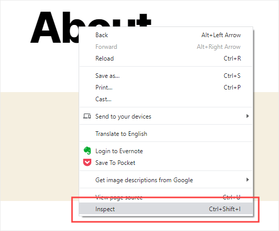
A new pane will open up on the right-hand side, like this:
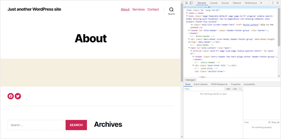
In the developer view, you will be able to see your site’s HTML source code.
Next, click the ‘Toggle Device Toolbar’ button to change to the mobile view.
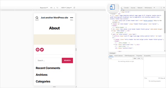
You’ll notice the preview of your website will shrink to the mobile screen size.
You’ll also notice your website’s appearance change to the mobile view. In the example above, the menu has collapsed and the Search icon has moved to the left instead of the right of the menu.
When you run your mouse cursor over the mobile view of your site, it’ll become a circle, like this:

This circle can be moved with your mouse to mimic the touchscreen on a mobile device.
You can also hold down the ‘Shift’ key, then click and move your mouse to simulate pinching the mobile screen to zoom in or out.
Above the mobile view of your site, you’ll see some additional options.
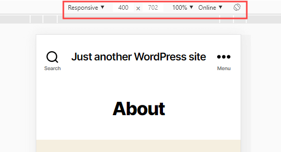
These let you do several extra things. You can check how your site would look on different types of smart phones. You can also simulate your site’s performance on fast or slow 3G connections. You can even rotate the mobile screen using the rotate icon.
How to Create Mobile Specific Content in WordPress
It’s important that your website has a responsive design, so your mobile visitors can easily navigate your website.
But simply having a responsive site may not go far enough. Users on mobile devices are often looking for different things than Desktop users.
Many premium themes and plugins let you create elements that display differently on desktop versus mobile. You can also use a page builder plugin like Beaver Builder to edit your landing pages in mobile view.
You should definitely create mobile-specific content for your lead generation forms. On mobile devices, these should ask for minimal information, ideally just an email address. They should also look good and be easy to close.
A great way to create mobile specific popups and lead-generation form is with OptinMonster. It is the most powerful WordPress popup plugin and lead generation tool in the market.
They have specific device targeting display rules that let you show different campaigns to mobile users vs desktop users. You can even combine that with OptinMonster’s geo-targeting feature and other advanced personalization features to get the best conversion.
We hope this article helped you learn how to preview the mobile layout of your site. You may also want to take a look at our article on the best plugins to convert a WordPress site into a mobile app.
Bonus: check out our pick of the best business phone services, so you can add a click to call button for mobile users.
If you liked this article, then please subscribe to our YouTube Channel for WordPress video tutorials. You can also find us on Twitter and Facebook.
The post How to View the Mobile Version of WordPress Sites from Desktop appeared first on WPBeginner.
Post a Comment